How to Create a New Kiosk Profile
A Kiosk Profile allows you to customise how your kiosk looks and behaves, from branding (colours, logos, standby media) to order flow and checkout options.
Once created, you can connect this profile to a physical device via Licence Code or a QR scan. Each kiosk device requires its own licence, which you can generate under Settings > Devices & Profiles > Device Licences.
Get Started
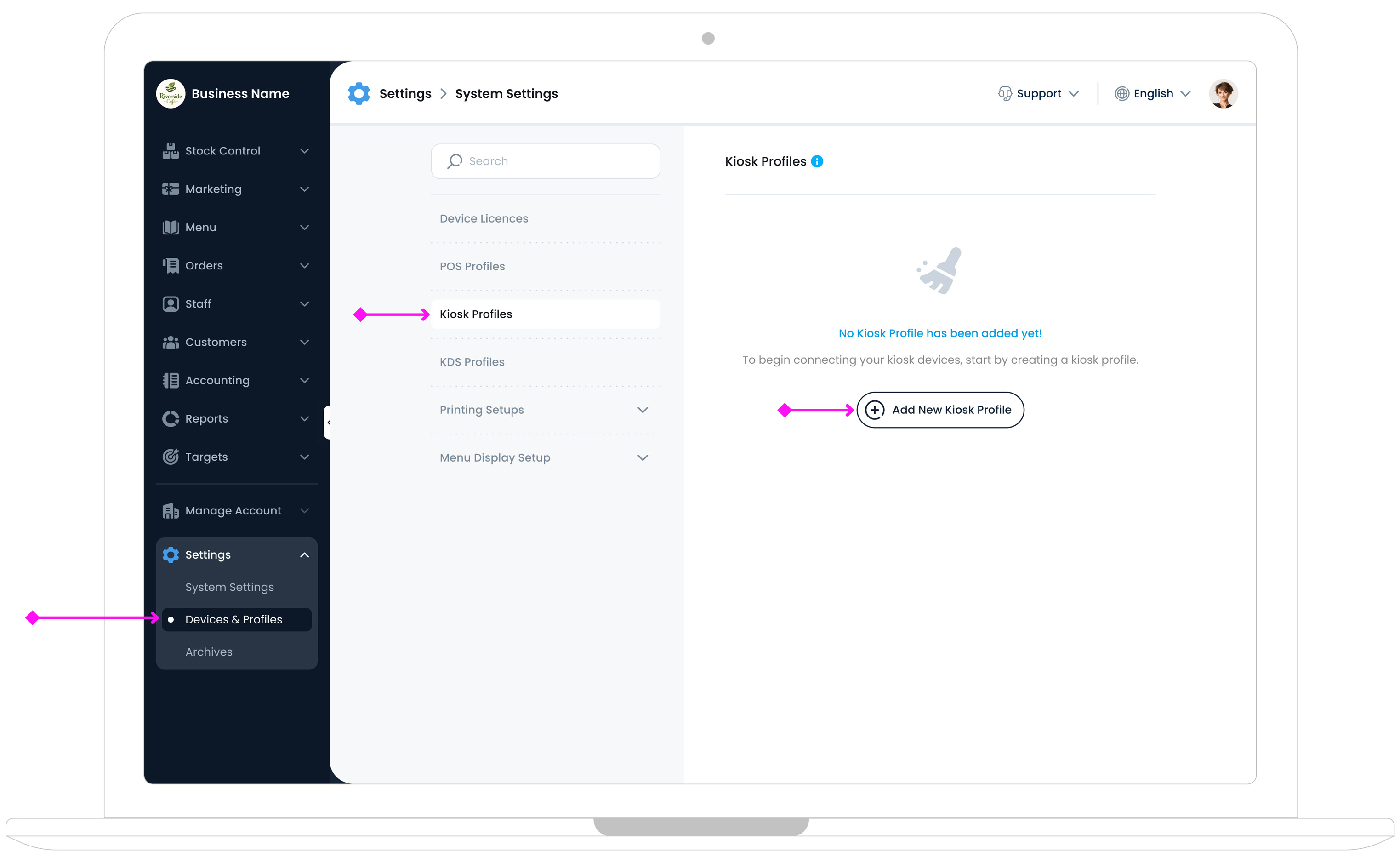
To create a new kiosk profile, in the TechSuite portal, go to
Settings > Devices and Profiles > Kiosk Profile
in your sidebar, then click the "Add New Kiosk Profile" button.

Main Profile Page Overview
On the left, you’ll see a Standby Page Preview. This shows how your kiosk’s main (standby) screen will appear once published. Any changes you make in the settings will update the preview in real time, helping you design a consistent, on‐brand experience.
On the right, you’ll find four main settings steps:
- Style and Branding: Customise the kiosk’s colours, logos, standby media, and button styling.
- Kiosk Order Process: Define how customers interact with the kiosk, including order flow and category layout.
- Checkout: Manage payment methods, receipt options, and any final steps before order completion.
- Integrations: Connect your kiosk to external services like payment providers and loyalty programs.
Step 1: Style & Branding
In this section, you’ll define how your kiosk looks by choosing its name, deciding whether to display a business logo, adjusting button styles and colours, and setting up your standby screen.
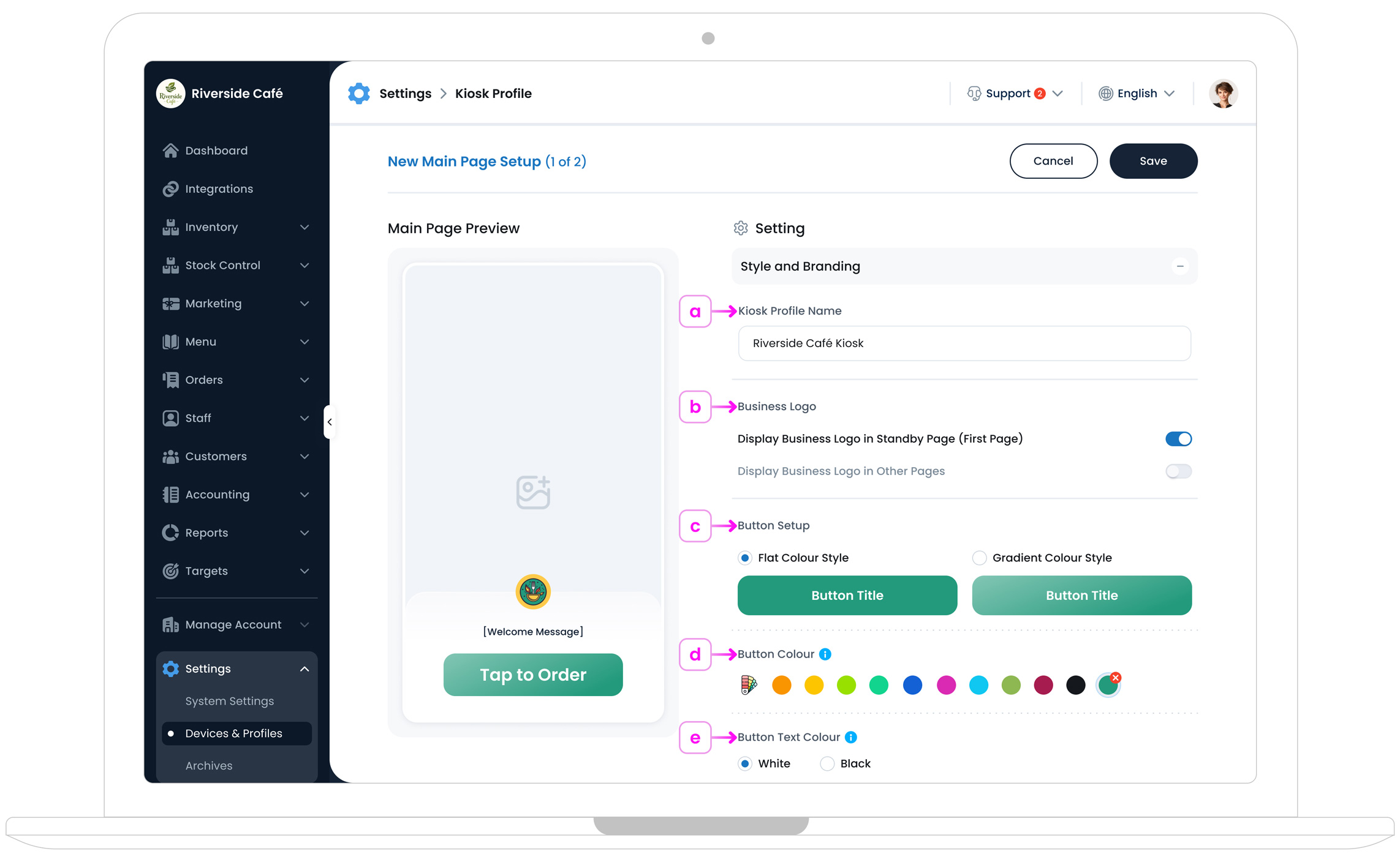
a. Kiosk Profile Name
Give your kiosk profile a clear, descriptive name (e.g., “Front Lobby Kiosk”). This name will help you identify the profile later, especially it would be more useful if you manage multiple kiosks.
b. Business Logo
Toggle on “Display Business Logo in Standby Page” if you want your logo to appear on the first screen of your kiosk. If you’d also like your logo shown in the kiosk’s header and on the final receipt page, enable “Display Logo on Other Pages & Receipts”.
Some businesses prefer to include logos directly in their background images or have branding guidelines that don’t require a separate logo overlay. If that’s the case, leave these toggles off and rely on your images for brand visibility.
Missing Logo Warning
If you see a warning about a missing logo, your business logo has not been set up yet. To add your logo, go to Manage Account > Subscription & Plans and upload your business logo. This ensures proper branding across your kiosk and other TechSuite features.
c. Button Style
Choose between Flat and Gradient styles for your main kiosk buttons.
d. Button Colour
Select a preset from our colour palette or define a custom colour code that matches your brand. Make sure the button stands out against your kiosk background for easy visibility.
To ensure clear, visible buttons in your kiosk pages, whether in solid colour or outline style, choose a colour that remains legible in both scenarios, making sure text and icons are easy to read whether the button is filled or outlined.
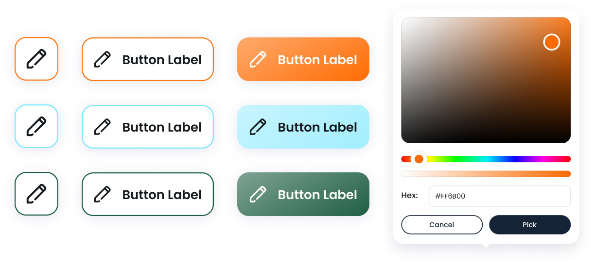
e. Button Text Colour
Choose whether the text on your buttons should be black or white. The goal is to ensure high contrast, making the text easy to read.
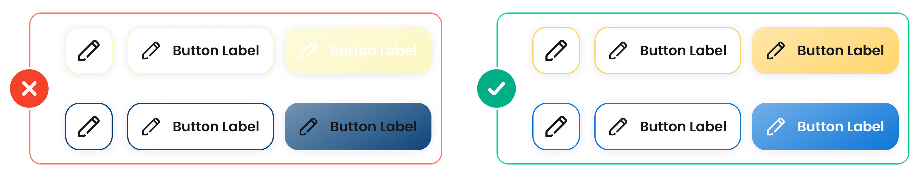
If you select a light-coloured button, such as yellow or pastel shades, use black text for better visibility. If you choose a dark-coloured button, like navy blue or deep green, opt for white text so it stands out clearly.
This simple contrast rule helps improve accessibility, ensuring customers of all ages can easily read and click the buttons on your kiosk.
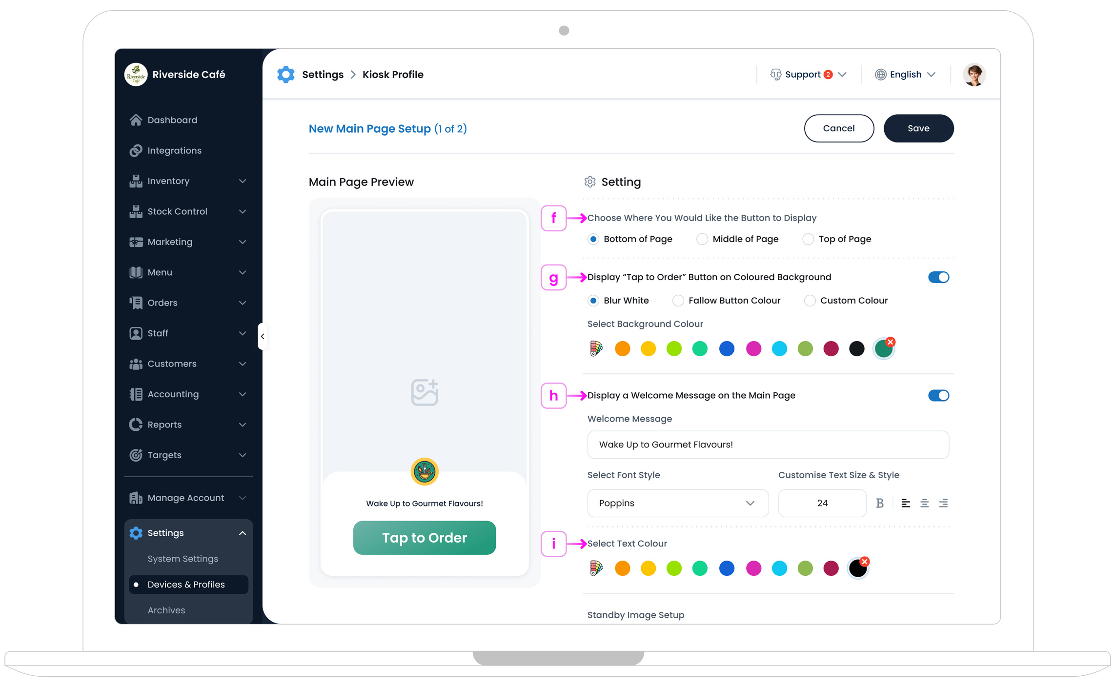
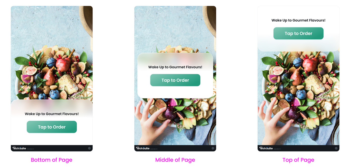
f. Choose Where You Would Like the Button to Display
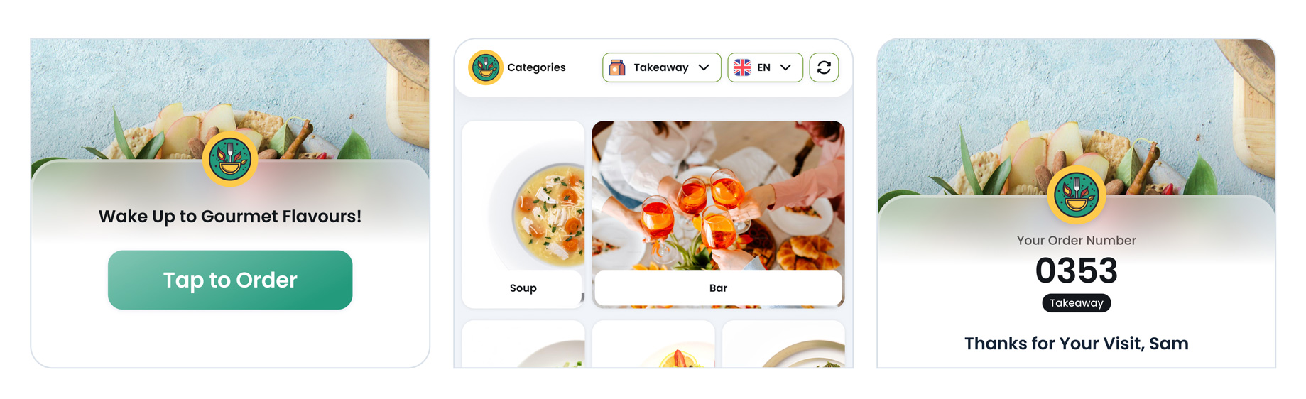
Use this setting to choose where the “Tap to Order” button appears on your kiosk’s main (standby) page.
You can place the button at the Top of Page, Middle of Page, or Bottom of Page. This helps you align the button with your standby media and welcome message, and keeps the screen clear and easy to use.
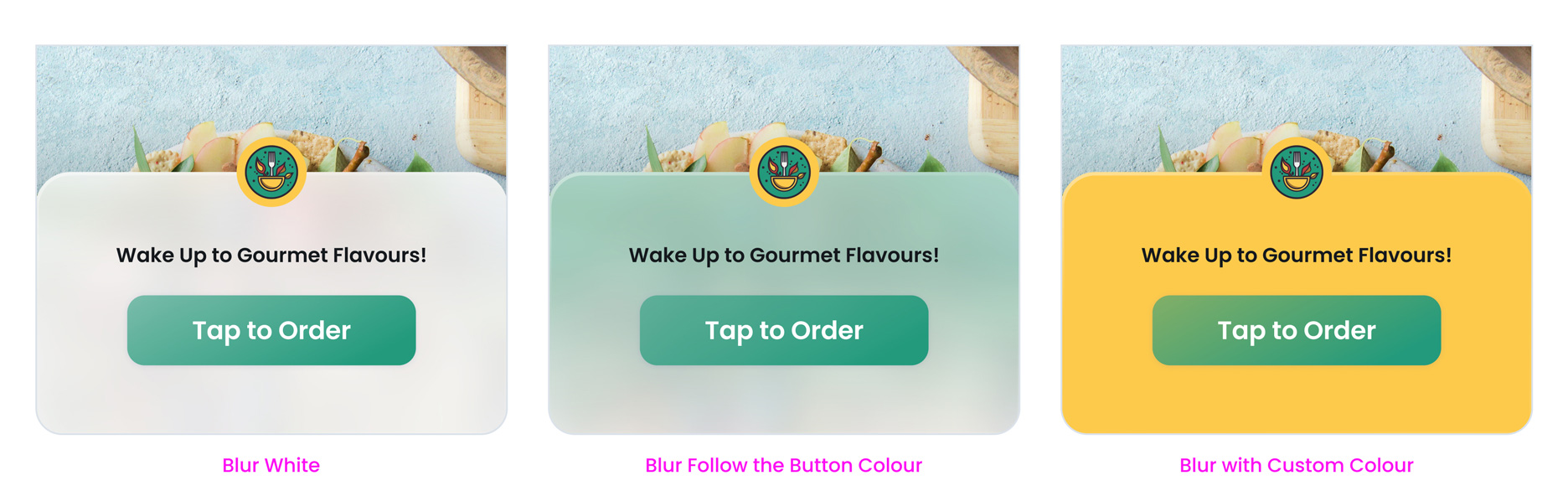
g. Display “Tap to Order” Button on Coloured Background
Enable this option if you want the “Tap to Order” button to sit on a coloured background panel. This helps the button stand out clearly, especially when your standby image or video has lots of colours or detail.
You can choose one of the following background styles:
- Blur White: Applies a soft white blur panel behind the button to improve contrast without adding strong colour.
- Follow Button Colour: Uses the same colour as your button, but in a blurred, frosted style (like the preview). This creates a modern, soft coloured panel behind the button.
- Custom Colour: Lets you choose a different background colour to match your design and improve readability.
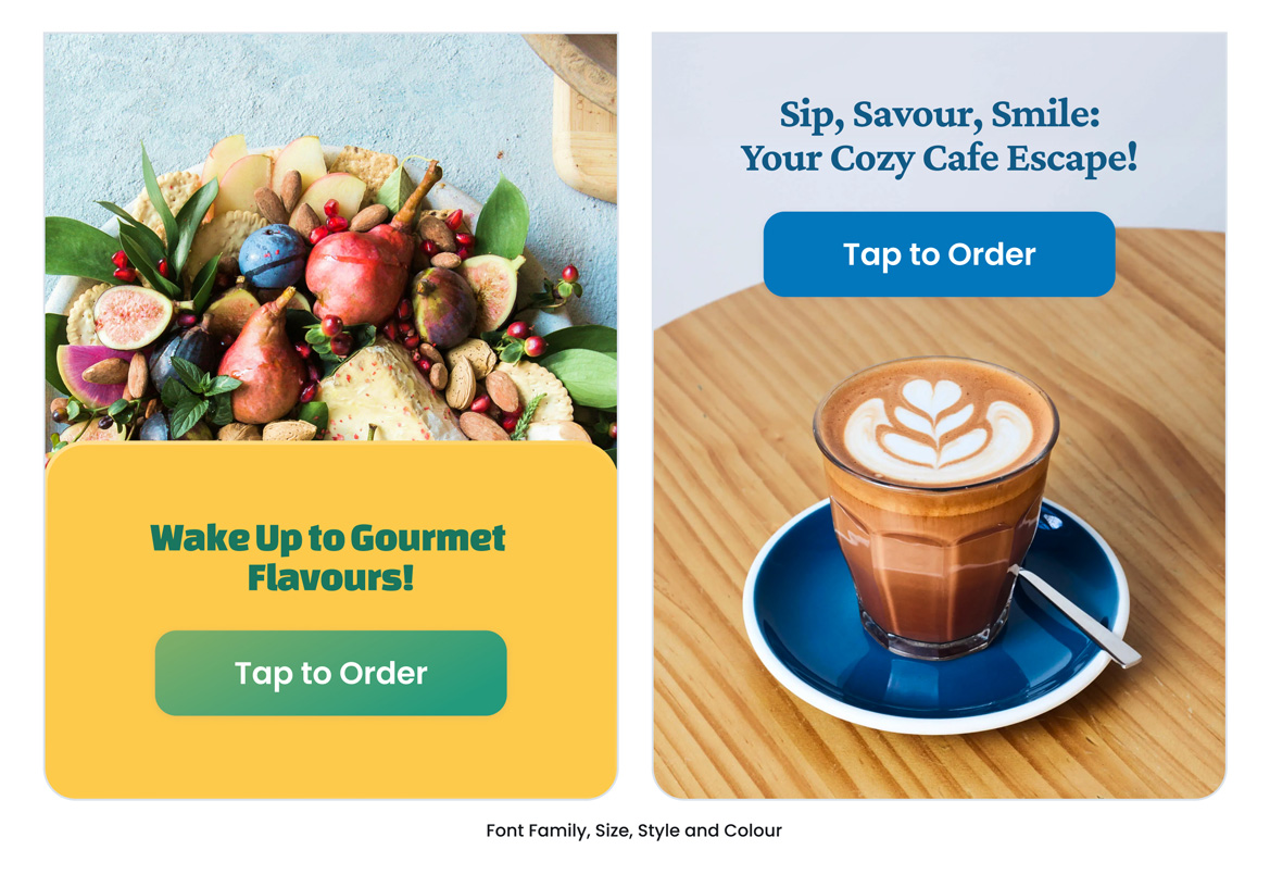
h. Welcome Message
Enable Display a Welcome Message on the Main Page if you want to show a short message above the “Tap to Order” button. This can be a friendly greeting or a simple call to action.
In the Welcome Message field, enter the text you want customers to see. Examples include “Welcome to Café Bliss” or “Tap to Order to get started”.
You can also customise how this message looks:
- Select Font Name: Choose the font used for your welcome message.
- Customise Text Size & Style: Pick a preset text style and set the font size to match your layout.
i. Select Text Colour
Use Select Text Colour to choose the colour of your Welcome Message text on the main kiosk page.
Pick a colour that stays readable against your standby background. For best results, use darker text on light backgrounds and lighter text on dark backgrounds.
j. Standby Image Setup
Customise the visual content displayed on the kiosk’s standby page by choosing from a single image, video, or slide of images.
This media is the first thing customers see before interacting with the kiosk. To upload an image, navigate to the relevant section, then click the "Upload Image" button. Choose an image from your device, and it will be added to your profile instantly.
To delete an image, hover over the uploaded Image and click on the trash bin icon that appears while hovering. This will remove the image from your profile, allowing you to replace or update visuals as needed.
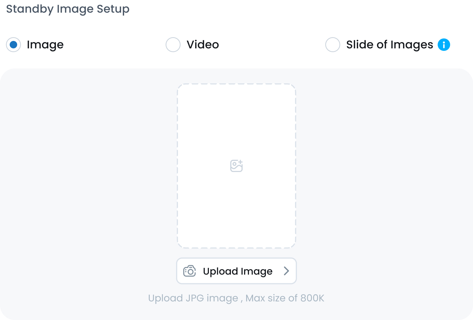
• Image
Select a single static image for your standby screen. This is the simplest option and ensures a clean, branded look.
Supported format: JPG
Maximum file size: 800 KB
• Video
Upload a video to make your standby page more dynamic and engaging. Videos can showcase menu items, brand introductions, or promotional content.
Supported format: MP4
Maximum file size: 10 MB
• Slide of Images
Display a rotating set of up to three images on your standby screen. This is ideal for highlighting promotions, seasonal specials, or multiple brand visuals.
Supported format: JPG
Maximum images: Up to 3
Maximum file size per image: 800
KB
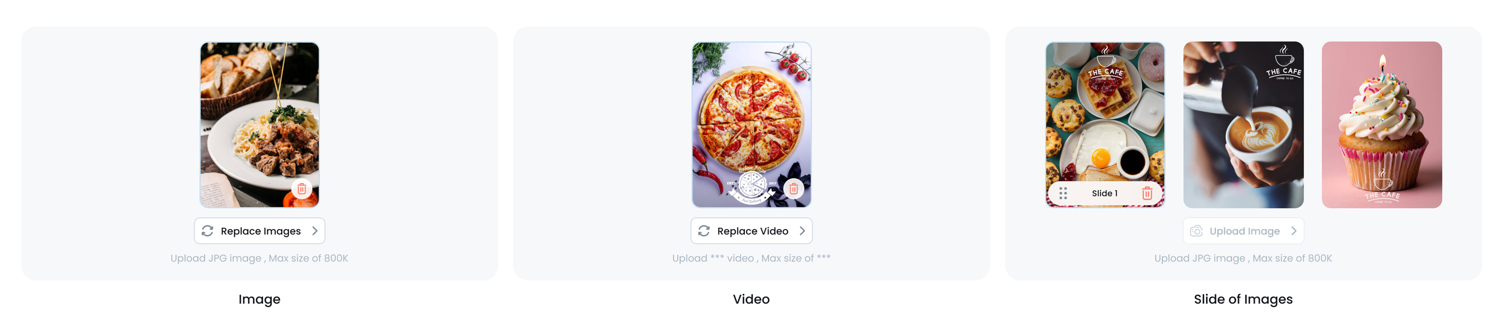
Image Guidelines and Pro Tips
-
Make it visually appealing
Choose an image that clearly shows the item, looks fresh, and sparks interest at a glance.
-
Avoid poor lighting or blur
Low-resolution or unclear photos can negatively affect how your menu is perceived.
-
Keep it consistent:
For a more professional and polished menu, aim to use images with similar lighting, angles, and backgrounds across your items.
-
Upload the Right Image Size
Use rectangle images sized 1200×800 or 1600×1000 pixels (landscape), in JPEG format for best compatibility. Keep file size under 800KB to ensure fast loading. Large images can slow performance, while small ones may appear blurry. Always preview your image to confirm it displays well across POS, kiosk, mobile, and online ordering. For resizing tips, see our Image Resizing Guide.
Step 2: Kiosk Order Process
In this step, you’ll decide how customers interact with your kiosk, choosing Sales Types (like In‐store or Takeaway) and setting up language preferences. These settings determine which options appear at the start of each order, ensuring the kiosk aligns with your business needs.
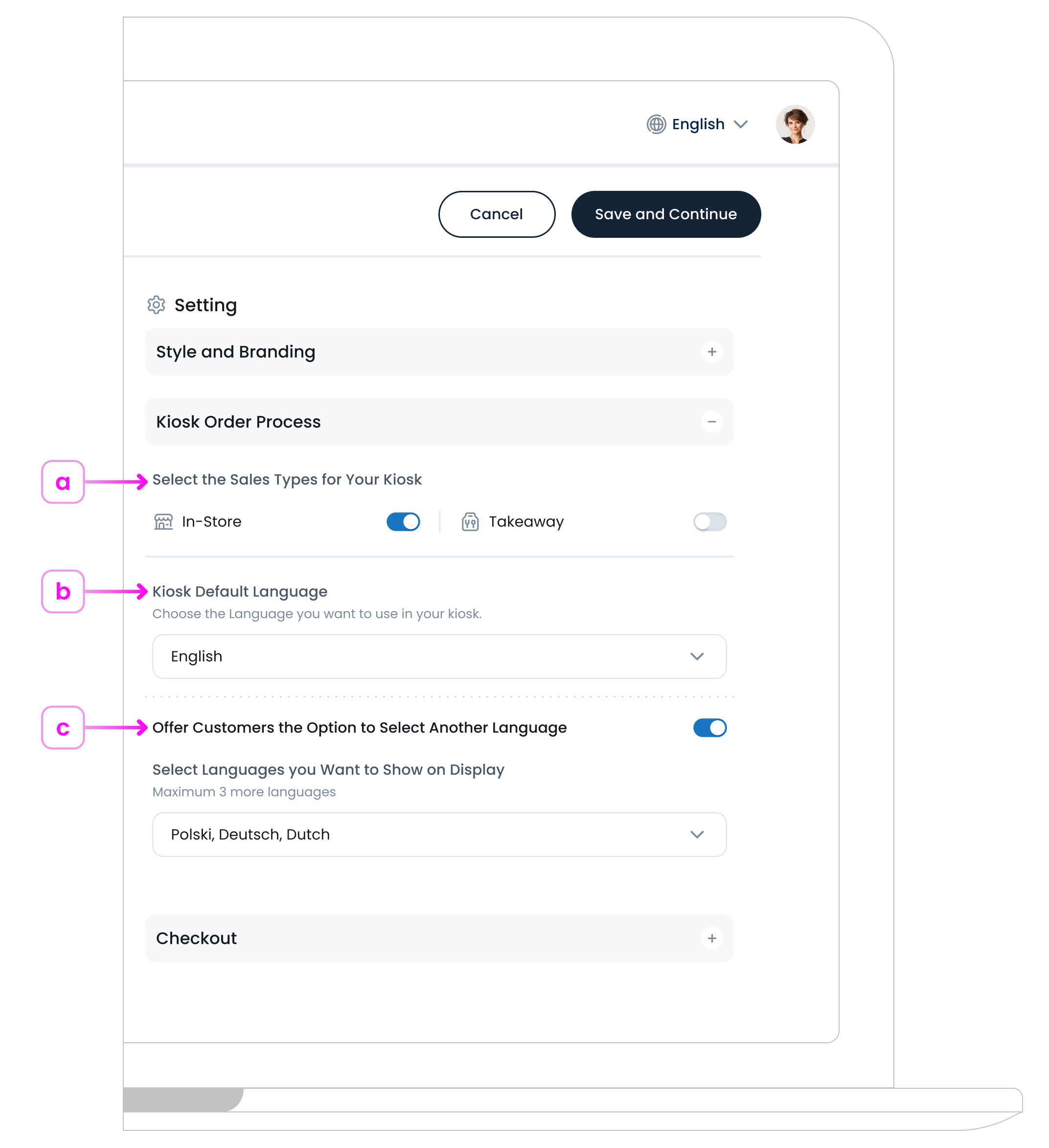
a. Select Sales Types
Toggle on “In‐store” or “Takeaway” (or both) to let customers select how they want to receive their order. Some businesses prefer only one sales type.
If you disable one sales type, the kiosk will automatically apply the other sales type.
b. Kiosk Default Language
Choose the primary language for your kiosk, which will be shown if no other language is selected or if multi-language support is off. This can match your region’s main language (e.g., English) or any other option your business supports.
c. Language Options (Optional)
If you want customers to select an alternative language at the kiosk, toggle on “Offer Customers the Option to Select Another Language”. This enables a language selection screen before ordering.
Here, you can choose up to 3 additional languages to be displayed alongside the default language. This means that on the first page, customers will see 4 languages (the default language plus the 3 you select).
Offering multiple language choices enhances accessibility and improves the overall customer experience.
Currently, TechSuite Kiosk supports 7 languages that you can select up to 3 of them:
English, Français, Español, Deutsch, العربية, Polski, Português
If disabled, the kiosk always uses the Default Language, skipping any multi‐language selection step.
Step 3: Checkout
In this stage, you decide how the kiosk finalises orders, by showing a completion message, optionally asking for customer names or allergens, and configuring receipts and payments.
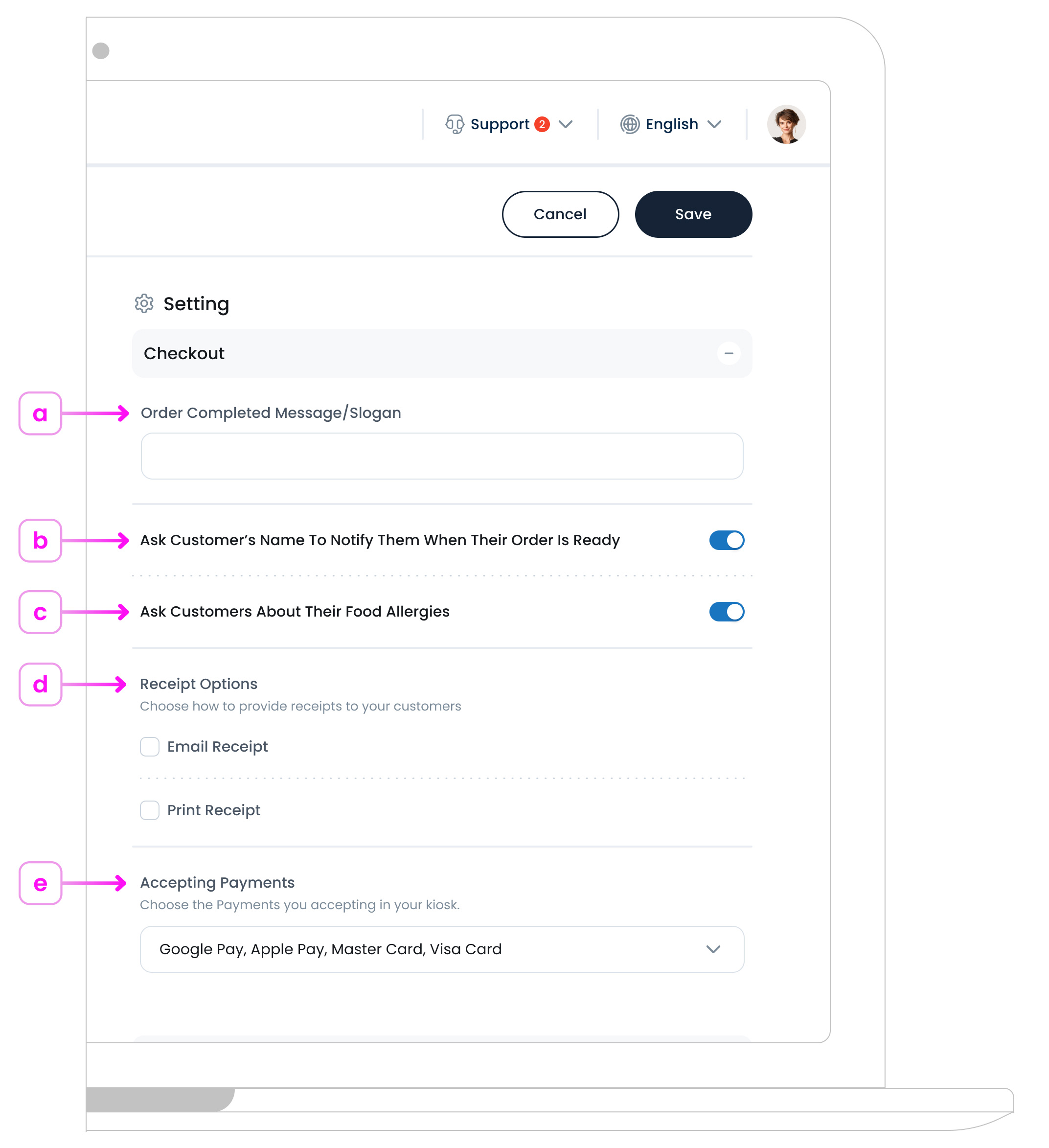
a. Order Completed Message/Slogan
Enter a short message or slogan to appear when the order is finished. For example, “Thank you for ordering! We’ll get started right away.”
This text confirms the purchase and lets customers know the kiosk has registered their order successfully.
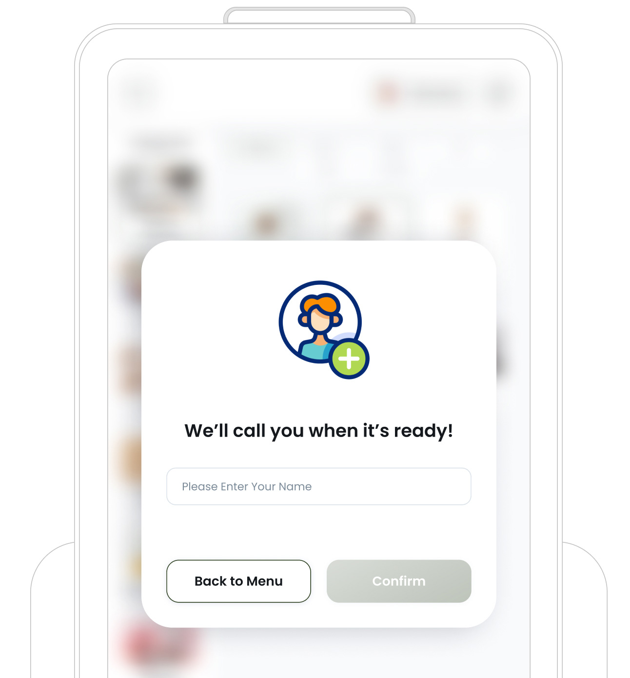
b. Ask the Customer’s Name To Notify Them When Their Order Is Ready
Toggle this on if you want the kiosk to prompt for a customer’s name during checkout. It’s especially useful for Takeaway or In‐store Self‐Pickup scenarios, where you’ll call out their name when the order is complete.
If disabled, no name prompt appears, and the kiosk simply moves on to the next step.
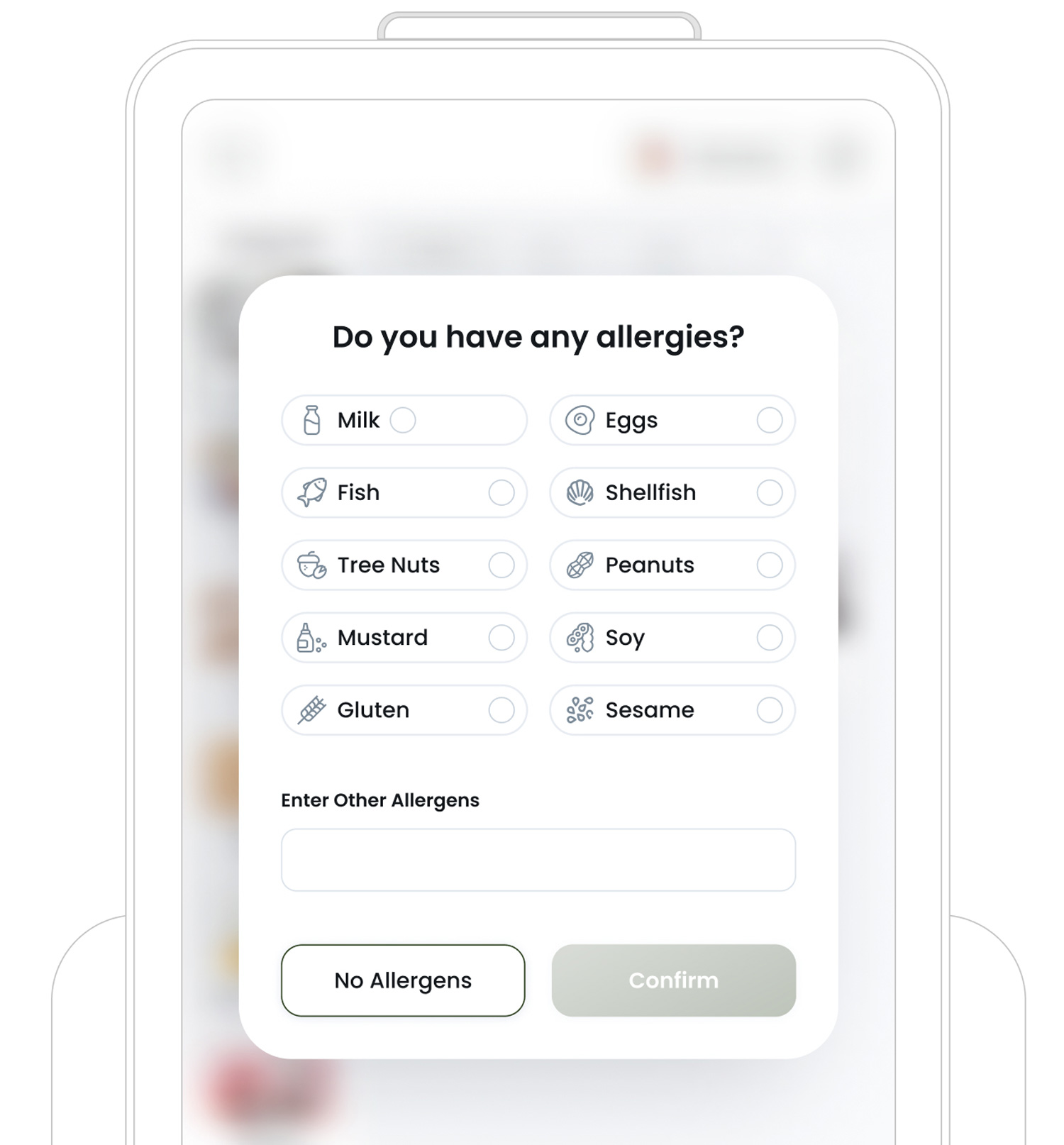
c. Ask Customers About Their Food Allergies
Enable this option to display an Allergen Popup before the order finalises. The customer can select from common allergens, like milk, peanuts, or gluten, or type in any others not listed.
Capturing allergen information can help your staff prepare items safely and inform customers of any potential cross‐contamination risks. If turned off, the kiosk will not prompt for allergen details at all.
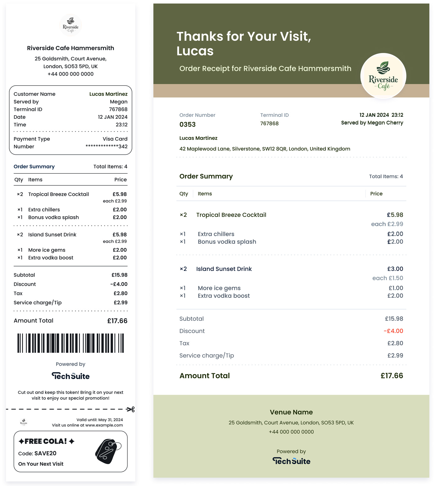
d. Receipt Options
You can decide how you want customers to receive their receipts, by email, by print, or both. If you select email only, it provides a paperless and eco-friendly way to deliver receipts. After a successful payment, a pop-up will appear prompting the customer to enter their email address. If you also select print, a receipt will automatically be printed after payment using your designated receipt printer.
To use this option, you’ll need to attach a "Receipt Template" to each section from your saved templates settings.
In TechSuite portal, in the Receipt Template settings, you can either choose one of the system’s ready-made templates or create your own for both printed and email receipts. Each template can be customised to reflect your branding, add your logo, promotional messages, or special offers, and they’ll show up whether the customer receives a printed receipt or an emailed PDF.
Keep in mind that print and email receipts require separate templates. Once you’ve finished designing them, just enable the relevant checkboxes below to activate printing or email delivery as part of your kiosk workflow.
e. Accepting Payments
Inform your customers which payment methods are accepted at this kiosk, such as Visa, MasterCard, Apple Pay, or Google Pay. The selected payment methods will be displayed on the kiosk’s Standby Page and during the Checkout process.
Step 4: Integrations
In this step, you’ll connect your kiosk to external services like payment providers and loyalty providers.
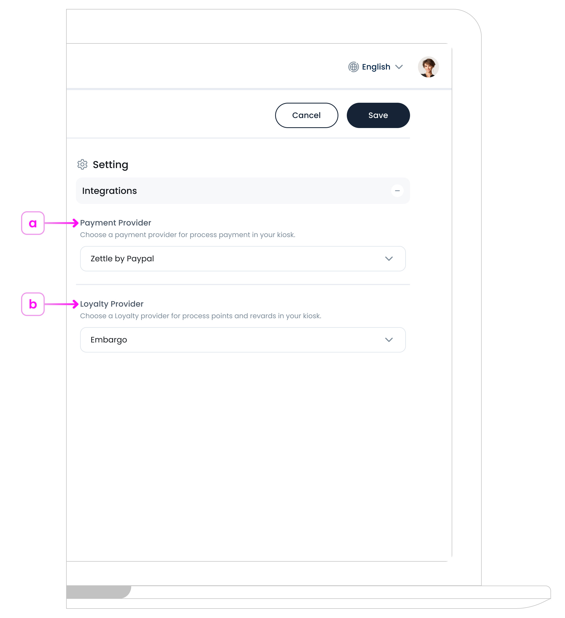
a. Payment Provider Integrations
If you want to accept payments directly at the kiosk, choose a payment provider.
Select your provider from the dropdown (e.g., iZettle). The kiosk will prompt customers to pay using that method at checkout.
b. Loyalty Program Integrations
If you have a loyalty program that you want customers to collect points or redeem rewards, select one of the integrated loyalty channels.
Save & Continue
After setting up your Main Profile Page, you
need to proceed to the next phase, Menu & Items Page Setup. Click the Save and Continue button
 to move forward.
Your kiosk profile settings will be saved, and you’ll be directed to the New Menu & Items Page Setup screen. Here, you’ll define how the menu & Item page interface looks and functions, ensuring a user-friendly experience for your customers.
Menu & Items Page Setup Overview
Once you’ve saved & continued, you’ll enter the New Menu & Items Page Setup process. This stage is crucial for designing how customers interact with both your kiosk’s menu page and item page.
On the left, you’ll see a live preview of your kiosk. You can switch between the Menu Page and Items Page using the preview selector at the top. This allows you to see how both pages will appear once published. Any changes you make in the settings will update the preview in real time, helping you design a consistent, on-brand experience across categories and items.
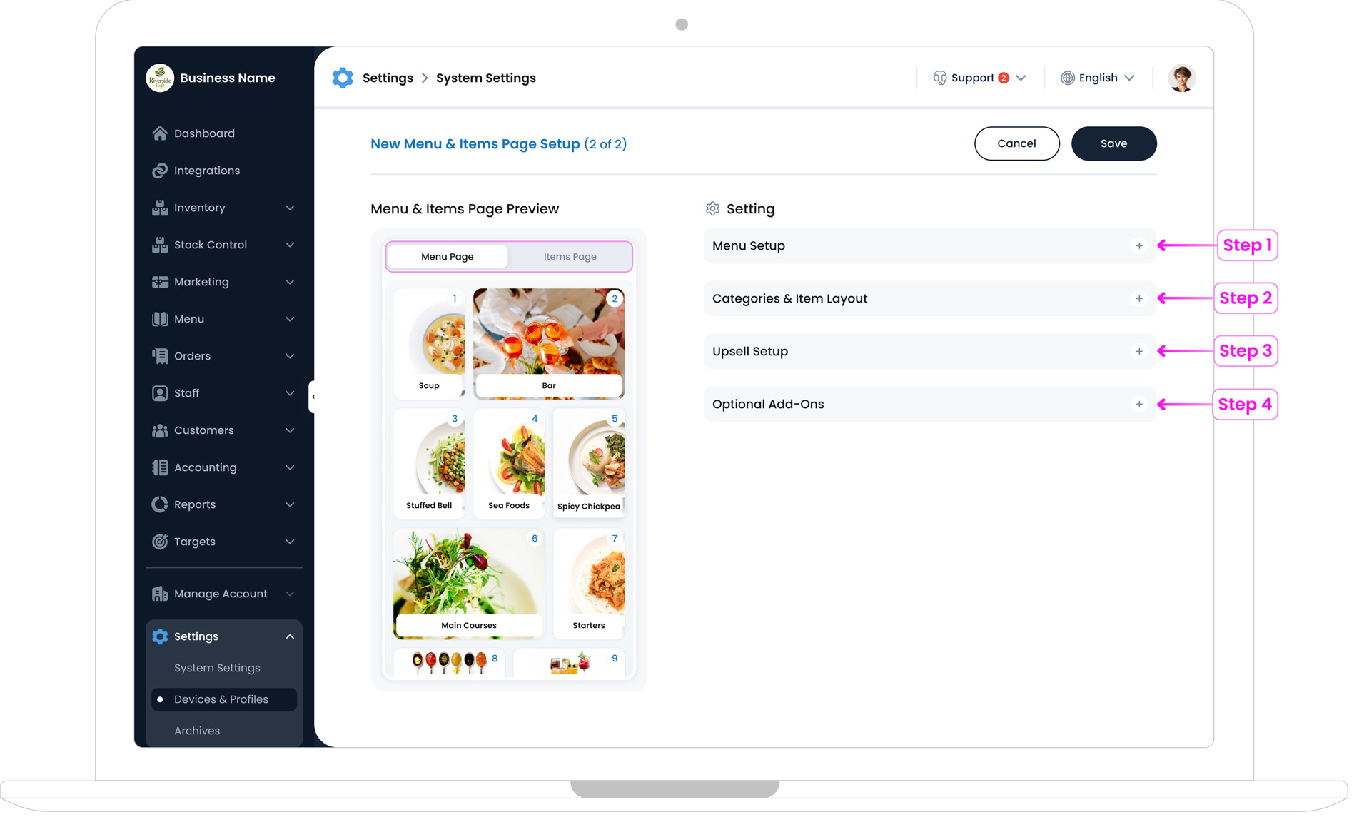
On the right, you’ll find three main setup sections:
- Step 1. Menu Setup: Design and customise how your menu page looks, including category card sizes, text visibility, fonts, colours, and the menu background style.
- Step 2. Categories and Item Layout: Control how individual items are displayed, including category banner position, card shape, item card size, and the background style for the items page.
- Step 3. Upsell Setup: Configure suggested items and upsell behaviour to automatically recommend additional or complementary products to customers during ordering.
- Step 4. Optional Add-ons: This feature helps you automatically recommend additional items based on the customer’s current order, popular choices, or complementary items. Activate this option to provide customers with tailored food suggestions, making it easy for them to explore more of your menu and boost your sales.
Step 1: Menu Page Setup
This section controls how your menu page looks and feels. It focuses on category presentation, layout, and visual styling, helping customers quickly understand your menu and navigate categories.
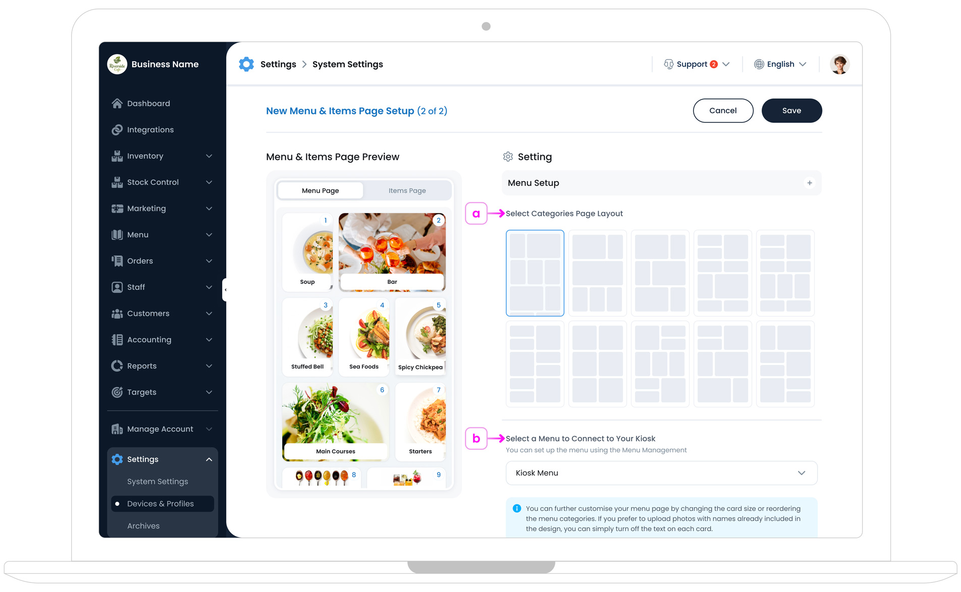
a. Select Your Main Menu Layout Style
Choose a grid layout for your menu categories. This determines how they appear on the main screen. Pick a structure that best suits your menu size, whether you have an image‐heavy design or a text‐focused approach.
b. Select a Menu to Connect to Your Kiosk
Assign an existing menu (e.g., “Breakfast Menu,” “Dinner Menu”) to this kiosk. You can manage or create menus in Menu Management before assigning them here.
Once linked, the kiosk displays only these categories and items, ensuring customers see the correct offerings.
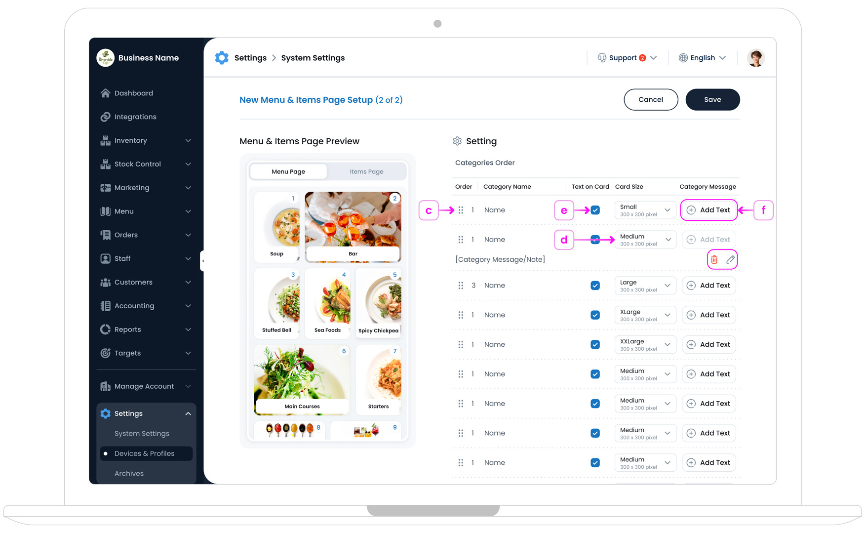
c. Reorder Categories
Simply drag & drop categories using the "reorder icon"
 . This icon appears when you hover over each category line on the left
side. Arrange them in the desired sequence to help customers quickly
find what they’re looking for.
. This icon appears when you hover over each category line on the left
side. Arrange them in the desired sequence to help customers quickly
find what they’re looking for.
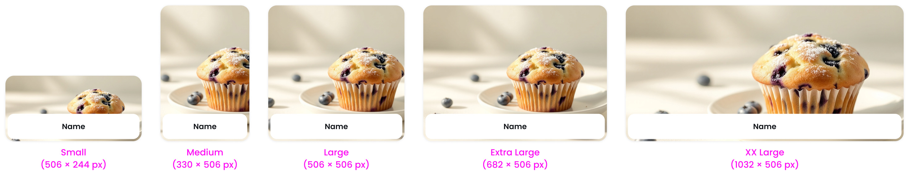
d. Set Category Display Style
Each category card can use a different card size to control its visual importance on the menu page. Include:
- Small (506 × 244 px)
- Medium (330 × 506 px)
- Large (506 × 506 px)
- Extra Large (682 × 506 px)
- XX Large (1032 × 506 px)
Larger cards are ideal for highlighting key categories or promotions, while smaller cards work well for secondary sections.
Menu Images Pro Tips
Before uploading category images, make sure you consider the card size you’ve selected for your kiosk menu. Each card size uses a specific image ratio (for example, XX Large – 1032 × 506 px), and your image will be displayed using that ratio on the kiosk.
Even if a category image appears square when you upload it in Inventory, it will be resized and cropped to match the card dimensions you choose here. To avoid unwanted cropping or stretched images, upload your category images using the exact dimensions of the card size you plan to use.
To make your menus truly eye-catching, ensure that the images you upload are high-quality, whether taken professionally or created as custom graphics with colour and text. Using clean backgrounds, such as white or light neutral tones, helps products stand out and creates a cohesive, professional look across your kiosk.
Keep in mind that these visuals not only enhance your branding but also make your kiosk more engaging and appealing to customers. Avoid using black-and-white images, as they can appear dull and may not attract as much attention in a vibrant menu display.
e. Show or Hide Category Name on Cards
Use this option to control whether the category name is displayed directly on the category card in the menu page.
If your category image already includes the category name as part of the design, you may prefer to hide the text label to create a cleaner and more visual layout.
This setting only affects how the category card appears on the menu page and does not change how items are displayed inside the category.
f. Category Message
The Category Message allows you to add a short description or message for a category. This message is shown at the top of the Items Page after a customer selects that category.
It’s useful for explaining what the category includes, highlighting special notes, or guiding customers before they browse the items.
You can edit or remove the category message at any time using the action buttons on the right side of the category row.
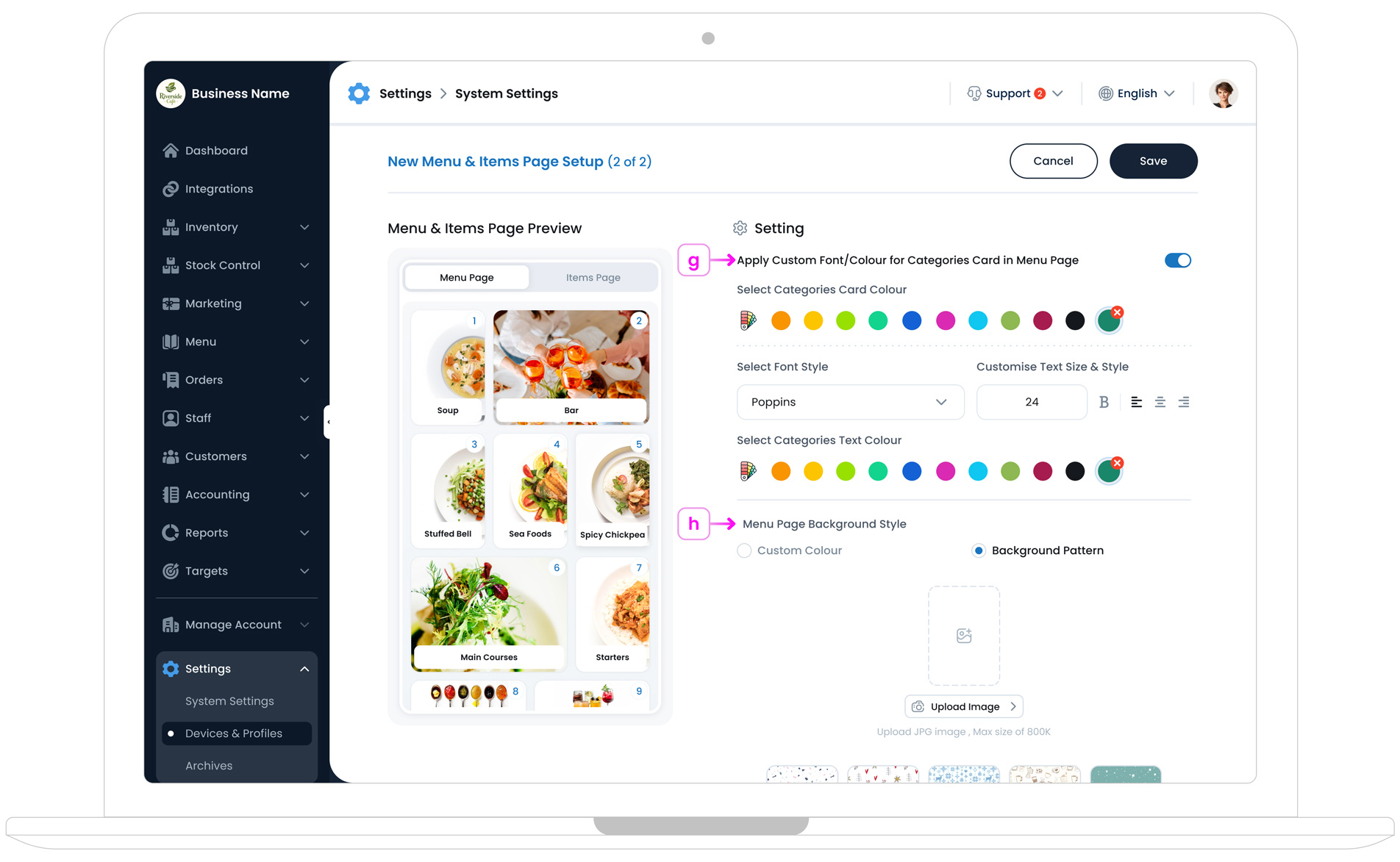
g. Apply Custom Font & Colour for Category Cards
Enable Apply Custom Font/Colour for Categories Card in Menu Page to customise how text appears on category cards.
You can:
- Choose a custom card background colour
- Select a font for category text
- Adjust text size and style
- Set a custom text colour
These settings apply to category cards only and help you match your menu design to your brand identity.
h. Menu Page Background Style
Customise the background of your menu page to enhance contrast and visual appeal.
- Custom Colour: Choose a solid background colour from the palette.
- Background Pattern: Select one of the built-in patterns or upload your own custom pattern to reflect your brand.
If you use a background pattern, we recommend choosing a subtle, low- contrast design so category cards remain easy to read and clearly visible.
Step 2: Categories & Item Layout
This section controls how your Items Page looks after a customer selects a category. It focuses on the category banner, item card layout, and background styling to ensure items are clear, readable, and easy to browse.
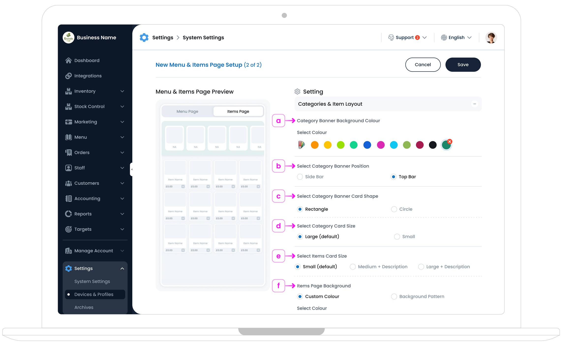
a. Category Banner Background Colour
Use this option to change the background colour of the category banner displayed on the Items Page.
You can select a custom colour from the palette, and any changes will be reflected instantly in the live preview. This helps you test contrast and readability before publishing.
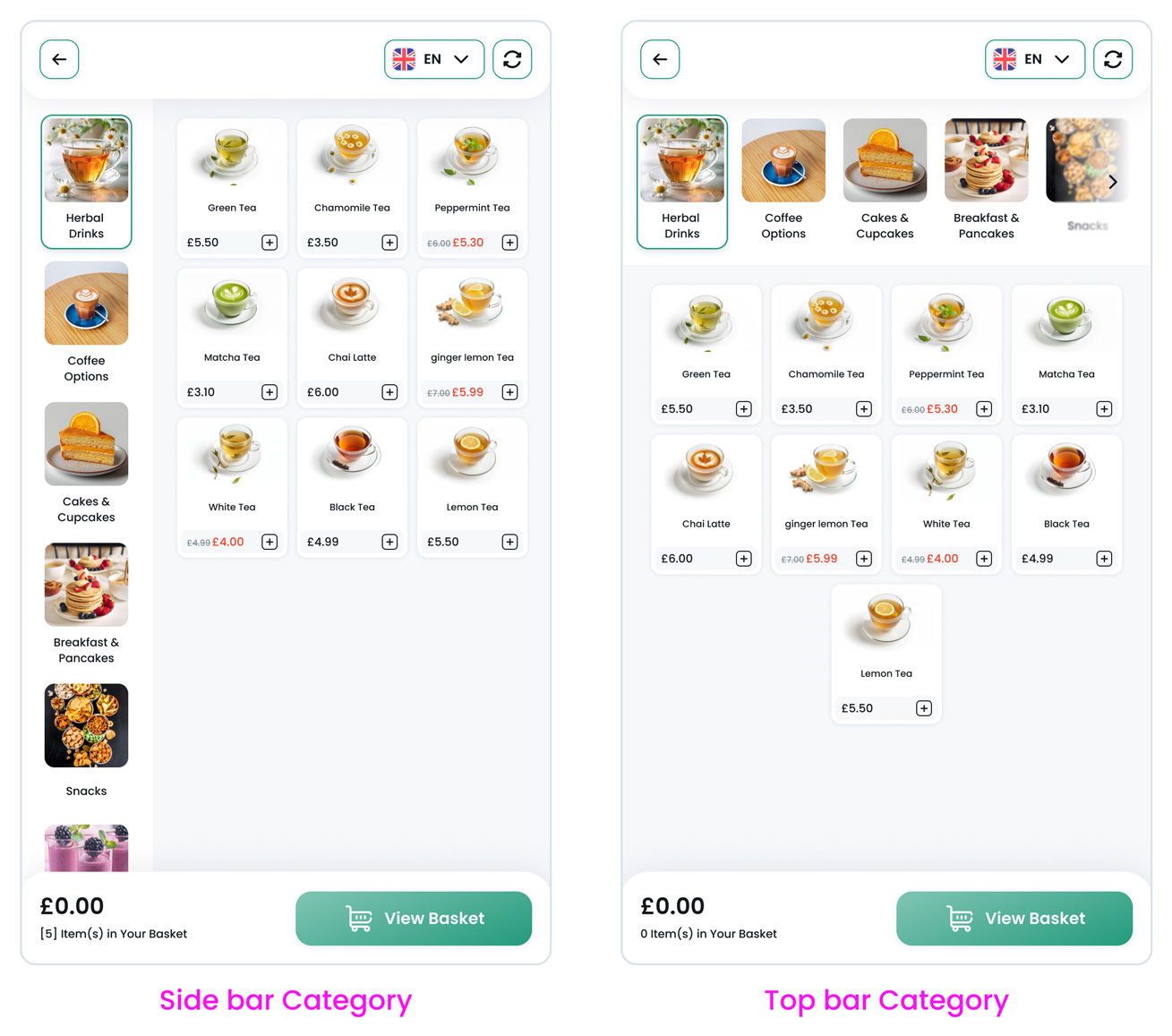
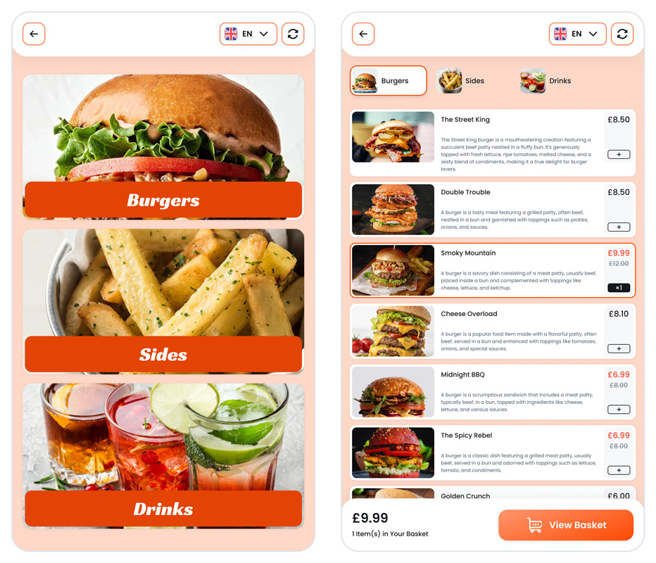
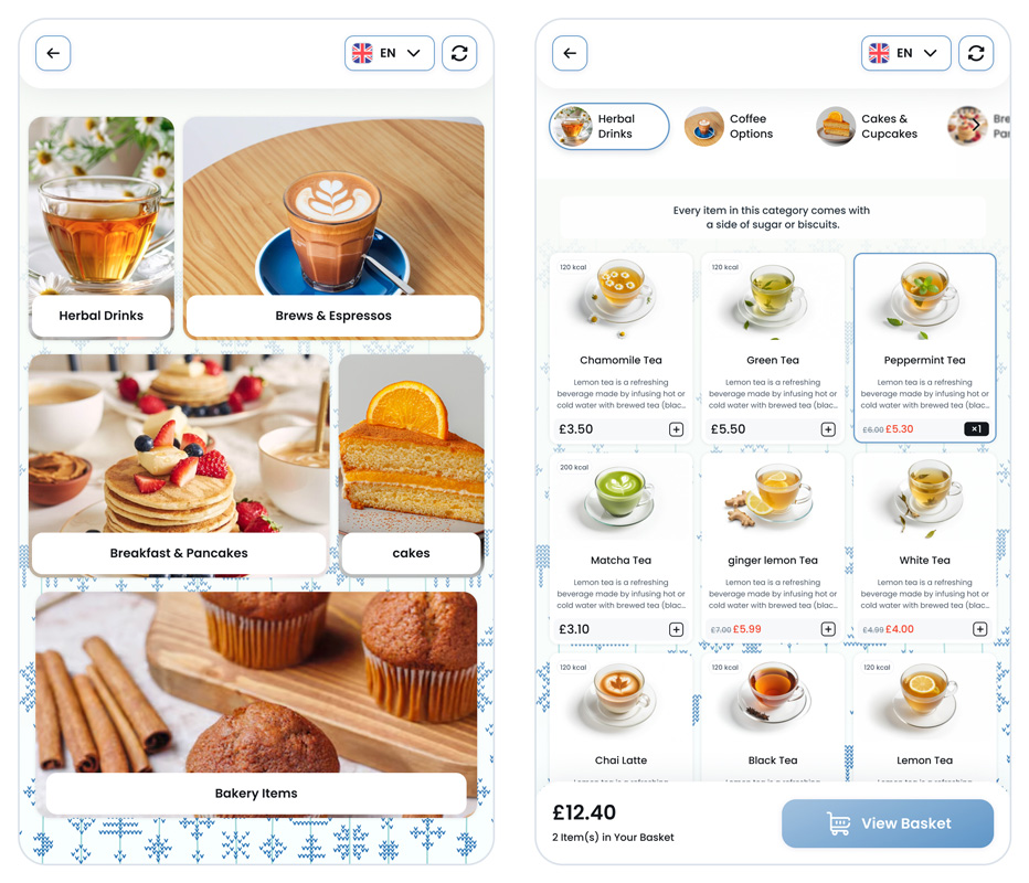
b. Select Category Banner Position
Choose where the category banner should appear on the Items Page:
- Top of Page: Displays the category banner across the top of the screen.
- Side of Page: Displays the category banner in a vertical sidebar.
The selected position updates immediately in the preview, allowing you to choose the layout that best fits your menu and screen size.
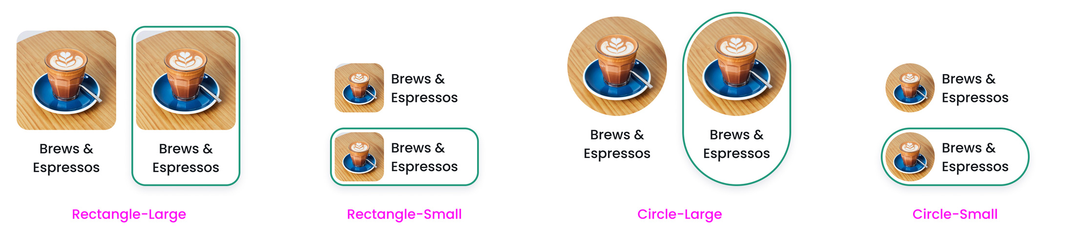
c. Select Category Banner Card Shape
Control the shape of the category banner card shown on the Items Page.
- Rectangle
- Circle
Changing this setting updates the banner style in the live preview, so you can match the look and feel of your kiosk to your brand design.
d. Select Category Card Size
Choose the size of category cards displayed on the Items Page.
If your coffee shop or restaurant offers a wide range of categories, it’s recommended to use a sidebar layout with smaller cards. This keeps navigation clear and avoids overcrowding the screen.
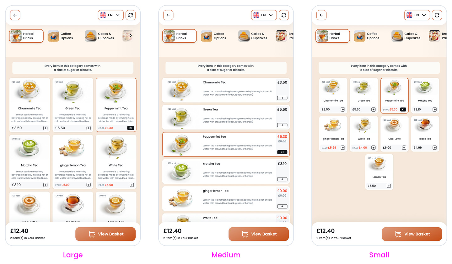
e. Select Items Card Size
Control how individual items are displayed within a category by choosing an item card size.
- Small (default)
- Medium with description
- Large with description
Larger card sizes work well when item descriptions are important for decision-making, while smaller cards are ideal for fast ordering environments.
f. Items Page Background Style
Customise the background of the Items Page to improve contrast and visual clarity.
- Custom Colour: Choose a solid background colour from the palette.
- Background Pattern: Select one of the built-in patterns or upload your own custom pattern.
For best results, use subtle colours or low-contrast patterns so item cards remain easy to read and visually clear.
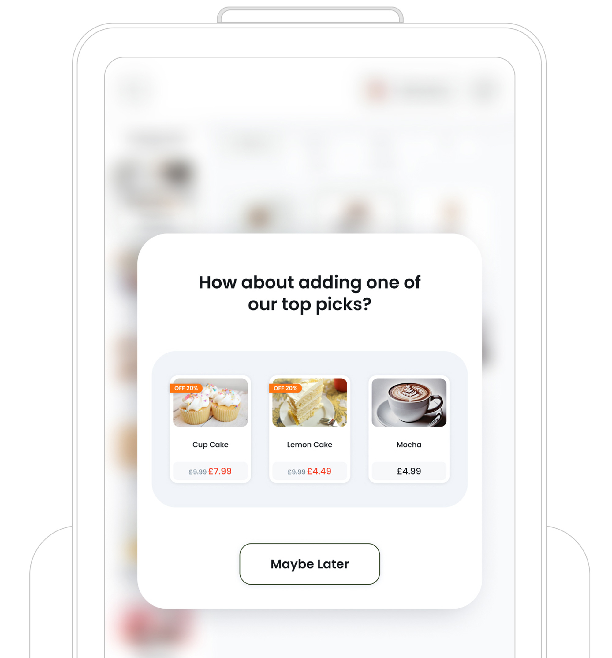
Below are two examples of kiosks that have had their menus and item pages customised.
Step 3: Upsell Setup
This section helps you increase average order value by suggesting additional or complementary items to customers during the ordering process.
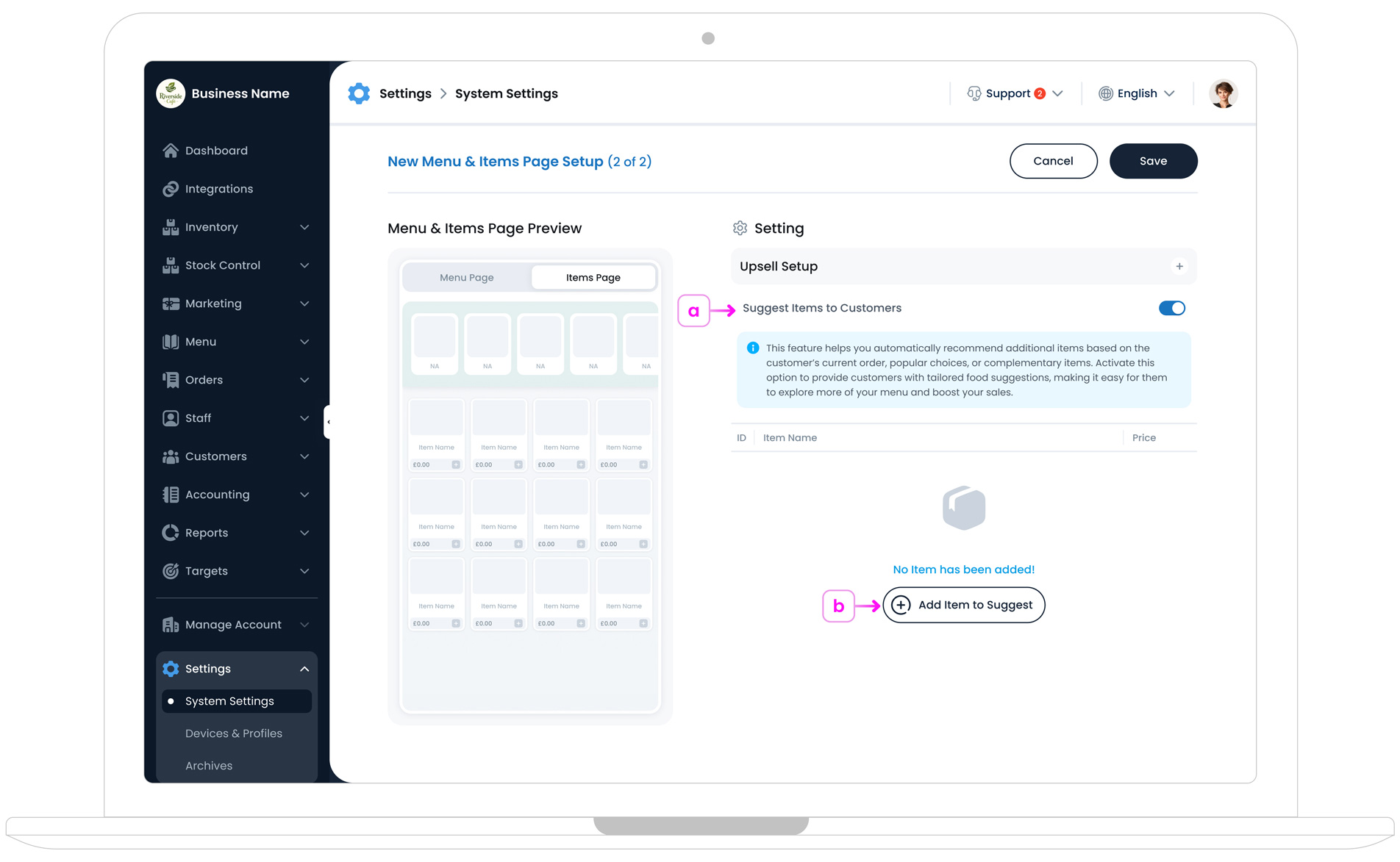
a. Enable Suggested Items
Enable Suggested Items to present upsells or recommended add-ons to customers while they are ordering.
This feature is particularly effective for promoting popular combos, sides, desserts, or complementary products, helping boost your average order value without disrupting the ordering flow.
b. Add Suggested Items
Manually add specific items you want to promote in this kiosk. For example, you might highlight a new dessert, a best-selling drink, or a limited-time offer.
These items will appear as recommendations to customers, encouraging them to add more to their order before checkout.
Step 4: Optional Add-ons
This section lets you offer optional extras (such as cutlery, carry bags, or other small add-ons) before payment. It helps customers quickly add useful items to their order without searching through the full menu.
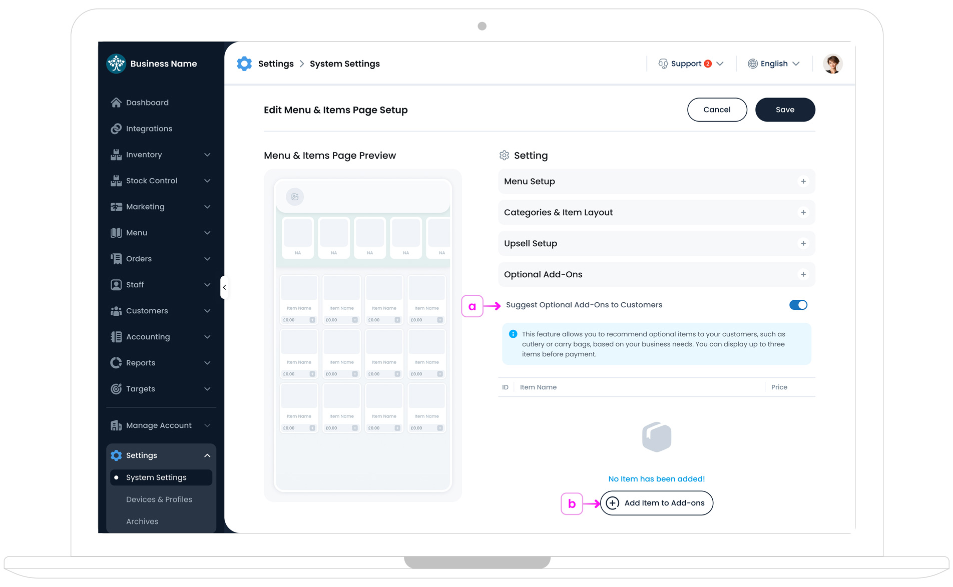
a. Suggest Optional Add-ons to Customers
Enable Suggest Optional Add-ons to Customers to show optional items before payment. This is useful for items customers often need but may forget, such as cutlery or a carry bag.
You can display up to three optional add-ons at a time.
b. Add Item to Add-ons
Click Add Item to Add-ons to add optional items to the list. Once added, they appear in the table with their ID, Item Name, and Price.
If no items have been added yet, you’ll see an empty state message, and the Add Item to Add-ons button will be shown under it.
Finalising & Save Your Setup
Once you’ve arranged your categories, selected a menu, and configured any
suggested items, click the "Save" button
 in the top‐right corner to finalise
your Kiosk Menu & Layout. Your kiosk is now fully configured and ready
to be connected to a physical device.
in the top‐right corner to finalise
your Kiosk Menu & Layout. Your kiosk is now fully configured and ready
to be connected to a physical device.
What’s Next?
Next, Download the TechSuite Kiosk App for your device.